|
I'll let you in to a little secret.....what you see on my page isn't always 'exactly' as it appears. Let me explain...... My props don't always match even though they may appear to. Yes, I have literally hundreds of wraps, blankets, hats and headbands, but often I can't always find EXACTLY the colour or tone that I'd like to match the vision I have for the image in my head. Maybe this contributes to my prop addiction (true story but I won't address this today....I'll save that for another blog). This is where Photoshop becomes my best friend and this blog post is going to uncover a few of the subtle little tweaks I make to my images to make them as perfect as I possibly can. Take this fully edited image of little baby Maisie for example.... 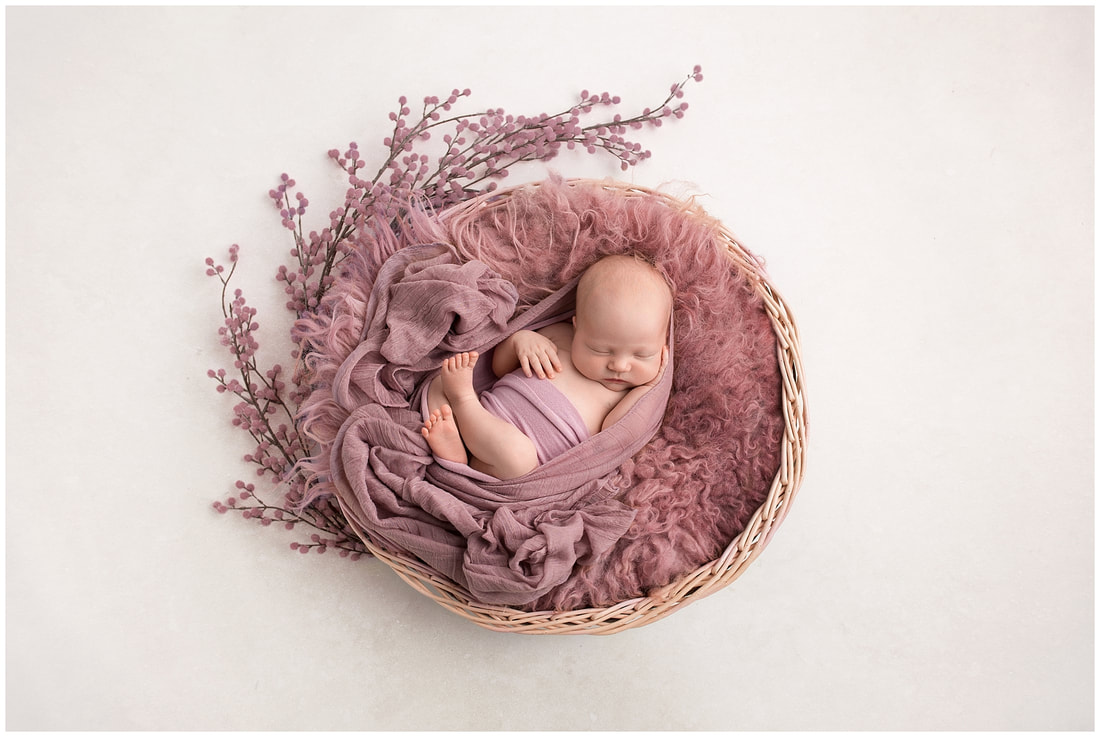 Would you be surprised to learn that the flowers weren't at all pink (quite the opposite in fact)?....and even though my wrap was pink and the flokati stuffer was pink, they didn't tone with the mauve cheesecloth wrap as well as I'd have liked them to. So here I'm going to lay my work bare for all to see! This image is straight out of camera (or SOOC as photographers like to say). I'll talk you through the changes that I made and why. 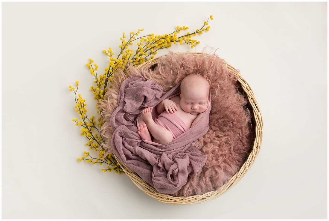 You will see that my flowers are yellow. This is the only colour that I have of these, but I love them so I often use them and just change the colour. A quick tweak in Photoshop allows me to alter the hue of the image and mask this off the baby so that only the flowers are affected. I then desaturated the pink wrap and added a yellow tone to help it blend with the mauve wrap. I changed the flokati stuffer very slightly by bringing out a cooler tone and more saturated colour to match the rest of the image. Finally, I made subtle little improvements until I was happy with the overall image. You can see that my basket is a bit battered and not perfectly round (probably because I stack it in spaces far too small for it). I refined it by reshaping it using Photohshop's liquify tool and reduced the size at one side so that Maisie appeared to be a little more central in the basket. I also filled the small gaps between the stuffer and the basket as these were distracting and drawing my eye away from beautiful little Maisie. The only thing left to do was to add a little contrast to the wrap and flokati to bring out the texture and added a stone texture to my paper backdrop to add interest. Hopefully you can see that all of these little changes overall make for a much more aesthetically pleasing image. When I planned and took this image the finished result that you see here is what I had in my head. I always knew that I was going to be changing the tones, and I tell parents not to worry if they see me using a prop that doesn't exactly match, as I'll fix it in post-production. Apart from the yellow, there wasn't anything 'wrong' with the image SOOC in my eye (that's obviously just my opinion, I'm sure other photographers could critique my work and give me a whole list of things that are wrong with it) but I still like to refine my work to give it a more polished and professional finish regardless. ......and all this time little Maisie was posing perfectly and completely oblivious to the changes that were made around her ;-) I hope that you have enjoyed a little glimpse into the effort that goes in to my photography behind the scenes following newborn sessions. I want every image to be absolutely perfect for you, and for you to know that not only do I give it my all in your sessions, but I spend hours behind the scenes to give you beautiful works of art that you can proudly hang on your walls for years to come. Here are the images side by side for you to compare. Please leave a little comment to let me know what you think and if you're surprised by the differences between SOOC and edited images. I'm now booking sessions between March and July. Please email me at [email protected] for further information. Lynne x 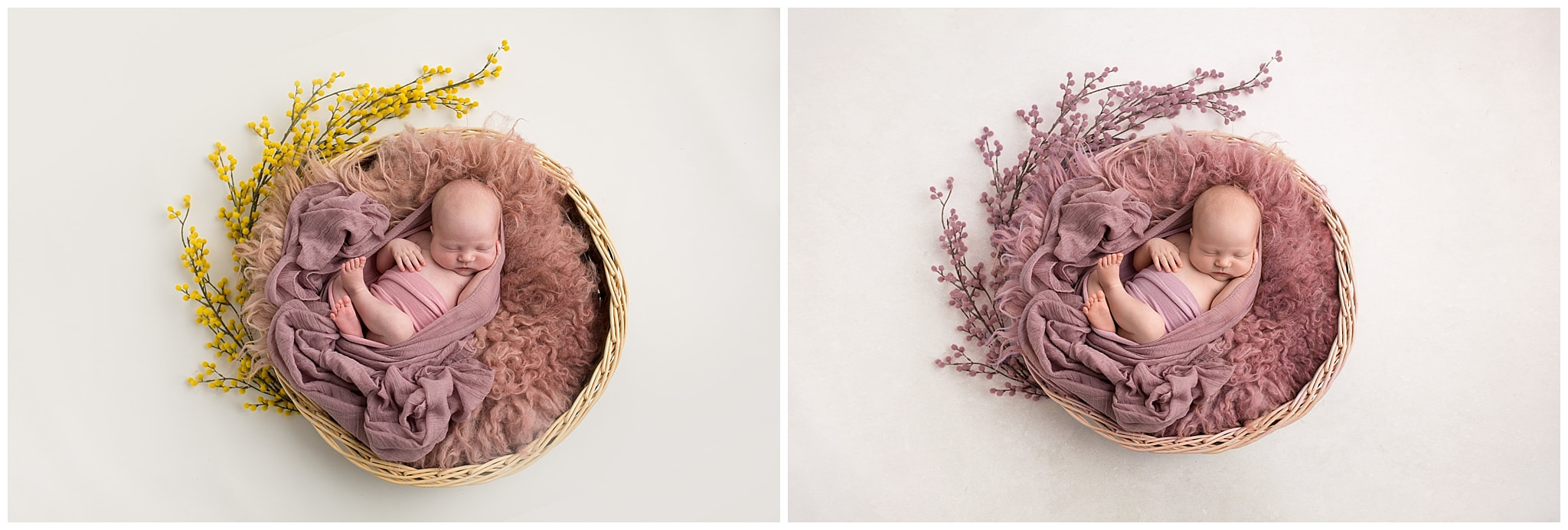 P.S. My newborn photography journey started 3 years ago when I trained with Jillian Greenhill Photography, who's specialises in UAE Newborn Photography in Abu Dhabi. Her newborn photography is still a huge influence on me but check out her blog to see the differences in our photography and editing styles.
14 Comments
Lynne
17/1/2018 11:34:57 pm
Thank you so much Maria - you are so kind!
Jill
18/1/2018 09:19:49 am
Thank you for sharing your technique Lynne. I love your finished edit so beautiful
Julie
18/1/2018 11:31:59 am
wow. I would have never have known that you had done this! It is just beautiful. You have a wonderful eye for colour.xx
Rosaleen
18/1/2018 11:44:54 am
Just love your work, everything looks so perfect, I can get lost in your posts for hours, they seem effortless (I know there not) perfection takes time, and patience. and yes Beatiful Babies
Emily
18/1/2018 01:18:57 pm
Thank you for sharing lynne. I love the liquify tool too! Beautiful x
Amanda
18/1/2018 04:56:17 pm
So cool to see the image before, would have never guessed the flowers were yellow! Beautiful!
bea
18/1/2018 10:28:23 pm
This is brilliant, id never have thought they were yellow to start with x 2/4/2024 10:44:58 pm
We offer affordable prices and significant discounts for bulk professional photo editing services. We charge reasonably for our service and provide the most reliable and top-quality service. We provide image editing, Graphics design, Video Editing, Web Design, and Development services. We care for our customers, their time, and their cost! Leave a Reply. |
 RSS Feed